Client
Personal Project
Year
2019
My Role
Data Visualization
UI Design
UX Design
Interaction Design
Front-End Development
UI Design
UX Design
Interaction Design
Front-End Development
Tools
D3.js
React.js
Python (for web scraping)
React.js
Python (for web scraping)
About the Project
Elections are a massive affair for both media houses and citizens. This tool visualizes the results of the Indian General Election from 2019. The objective was to offer good visual election reporting and let users gain meaningful insights by exploring the visualization.
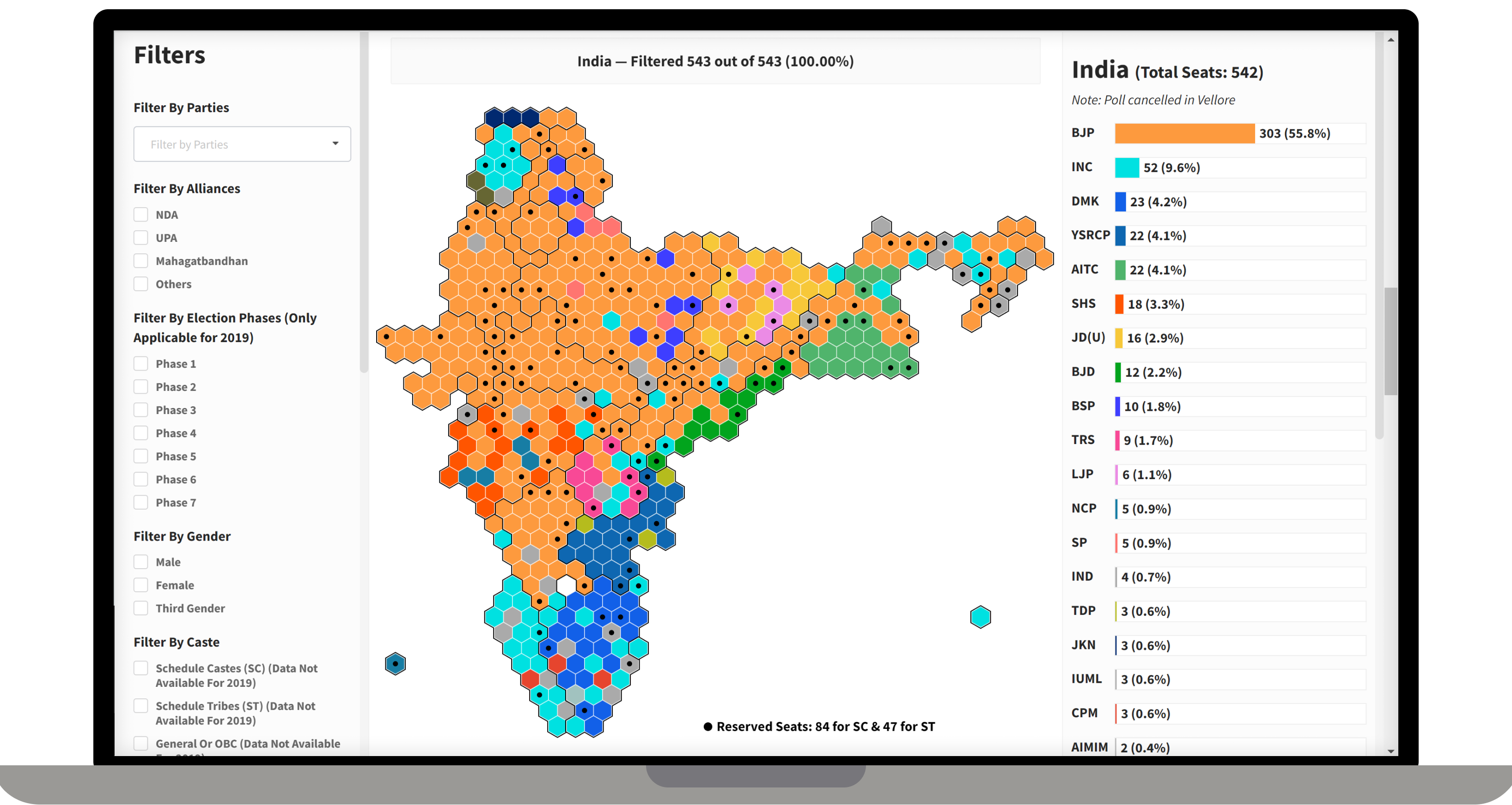
Hexagonal TIle Grid Map
Tile grid map is a variation of a choropleth map. In this map, areas are reduced to uniform size hexagons and the tiles are arranged to roughly approximate their real-world geographic locations. Tile grid maps avoid the visual imbalances inherent to traditional choropleths because of the area of the regions. Tile grid maps are a great option for mapped region data where areas are not part of the story we're trying to tell with the map.
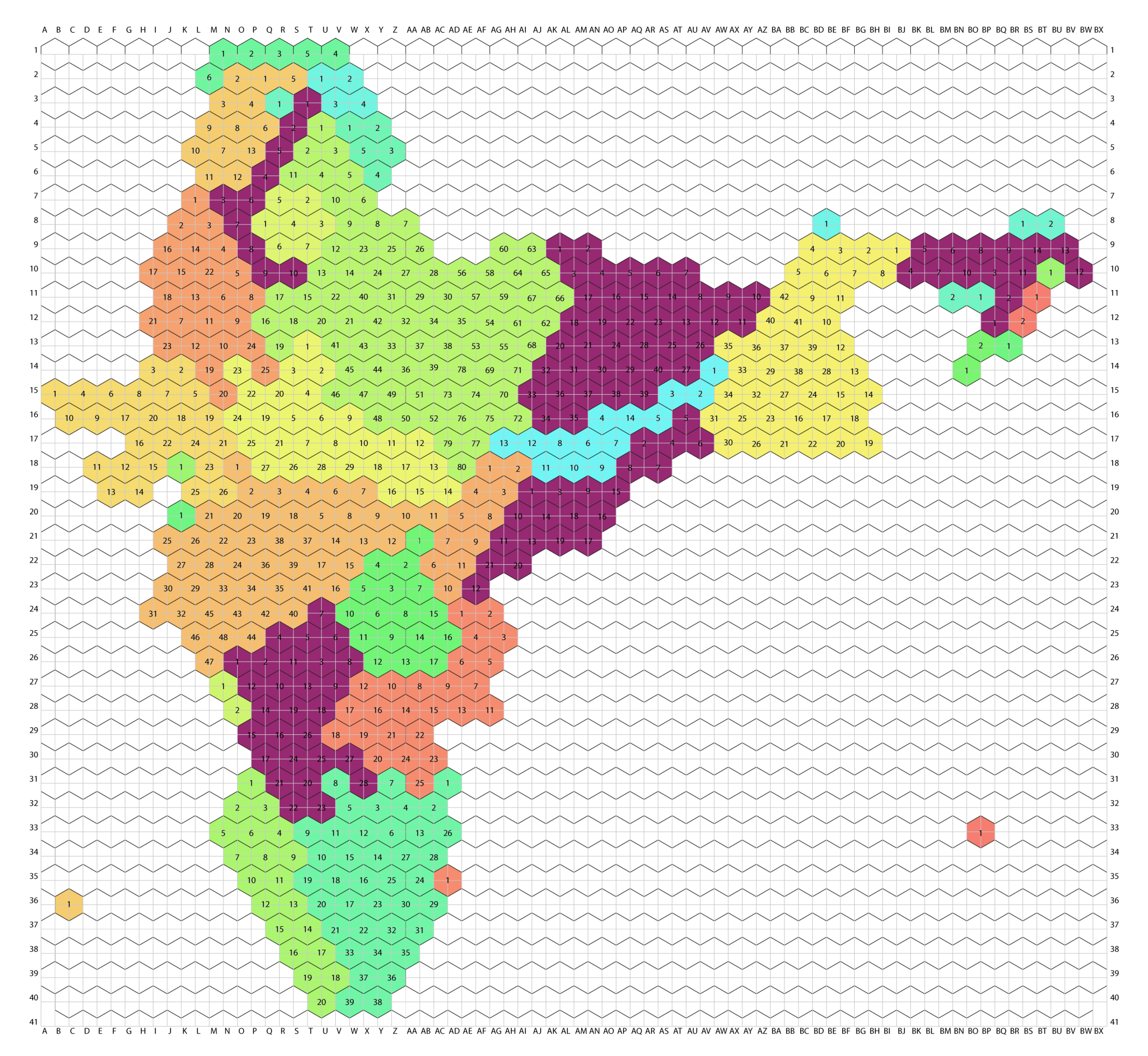
Since a hexagonal tile grid map didn't exist for the Indian constituency I started first by designing and building an open-source hexagonal tile grid map for Indian constituencies.
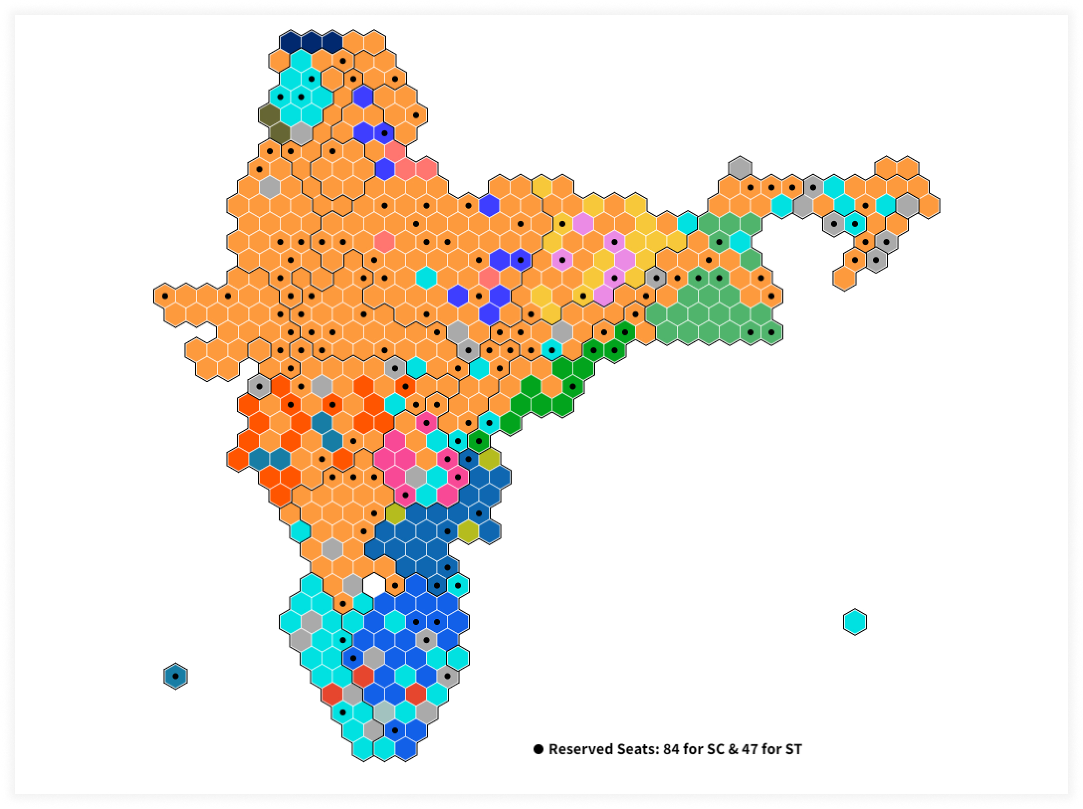
The final layout with the visualization looks like this:
Since a hexagonal tile grid map didn't exist for the Indian constituency I started first by designing and building an open-source hexagonal tile grid map for Indian constituencies.

The final layout with the visualization looks like this:
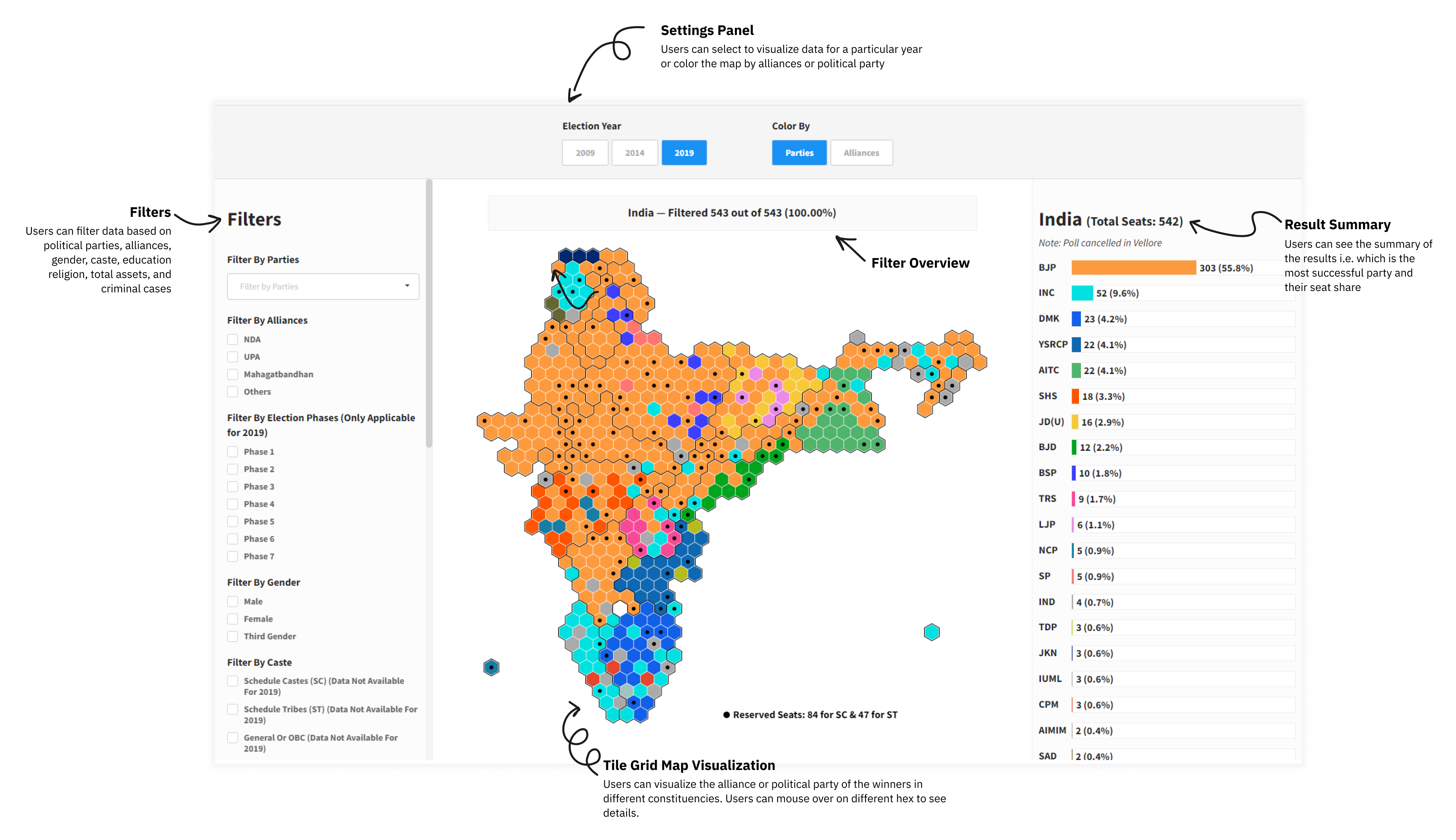
Key features
The tool is for users to explore the data and let users gain meaningful insights by exploring the visualization and adding different filters.The tool also lets users filter data based on political party, gender, caste, religion, total assets, and victory margin of the winners.
Other Visualizations
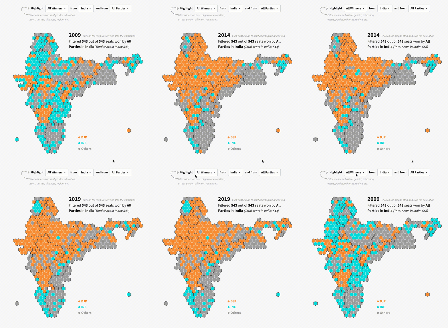
Animated Map
Visualizes the changes and patterns in election results through the year using animation.
List View
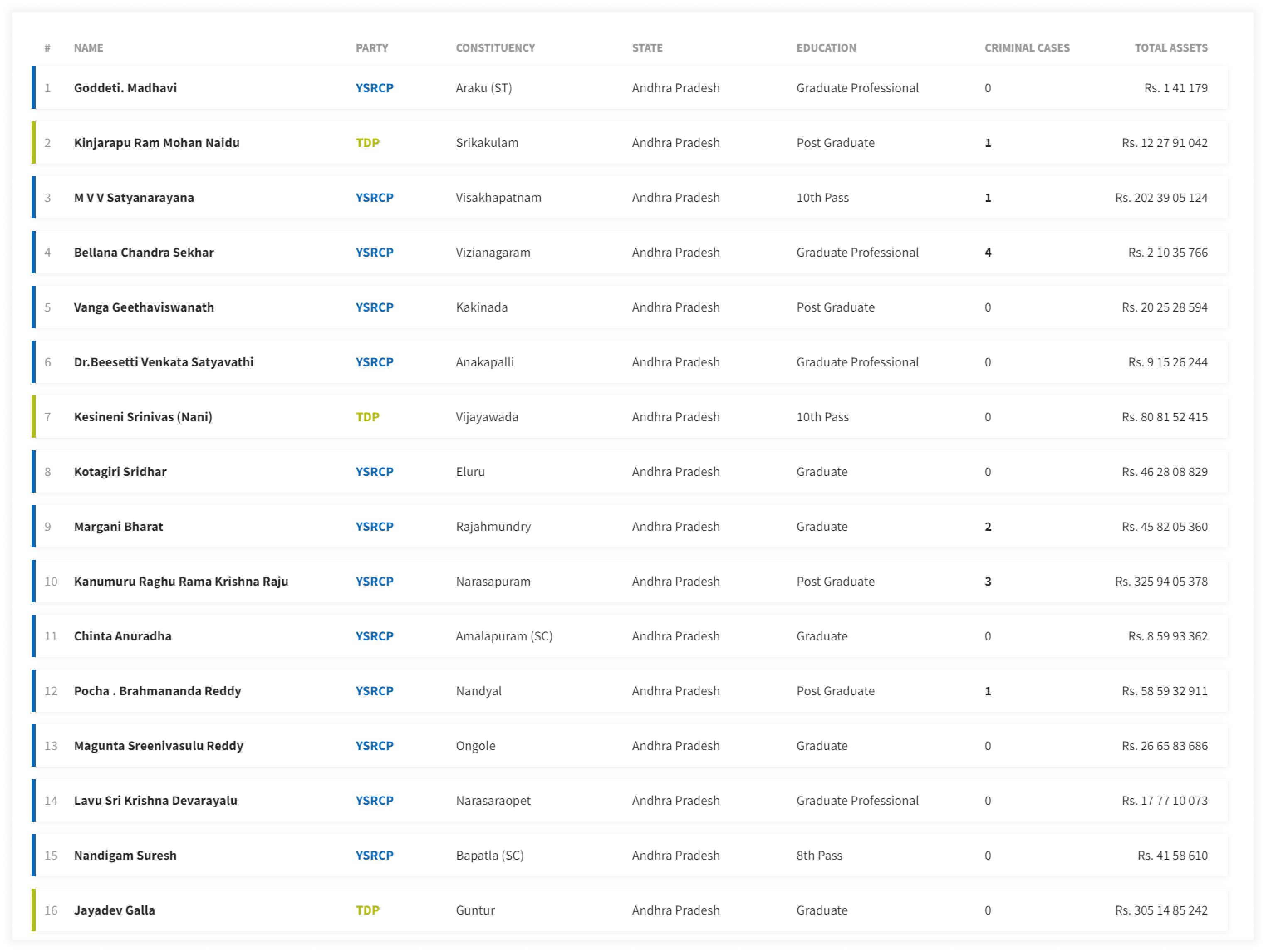
List view provides a list of all the winners that can be sorted by total assets, political party, states, education qualification, or criminal cases.